Inner Space Caverns
The Inner Space Caverns are an adventure, therefore the logo must represent that core element. The topographic map approach reflects the process of visitors journeying through the cavern. By incorporating meandering elements, the nature of cave formations is represented and experienced as the eye flows along the logo.
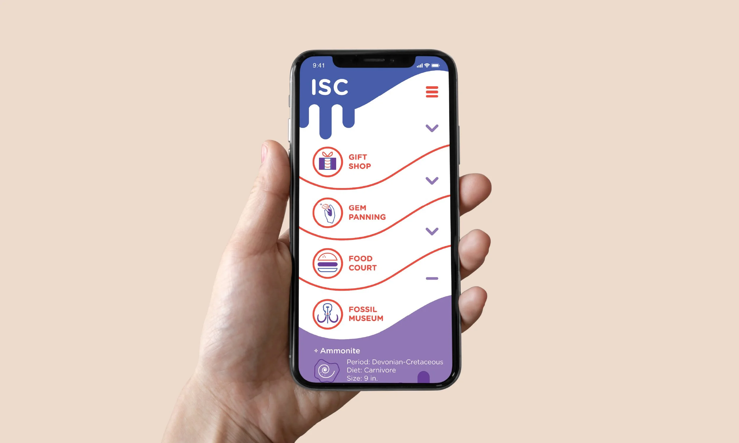
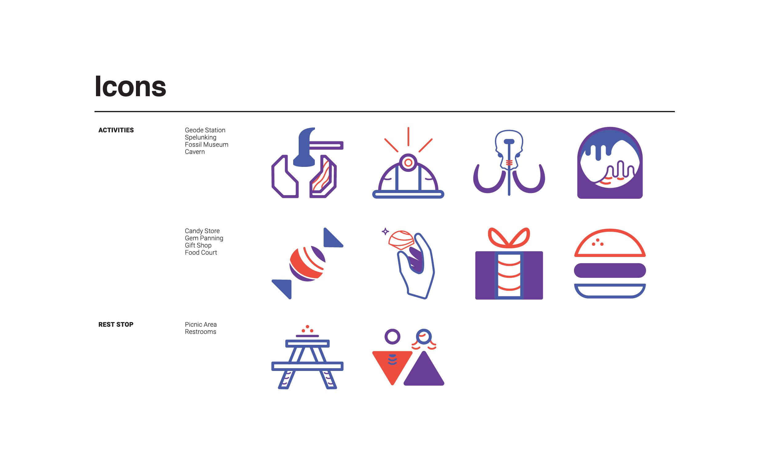
The Inner Space Caverns’ wayfinding iconography must be easily understood by children to provide safety and direction, as the target audience consists of families with young children.


